
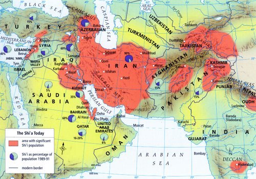
The red areas are where the Shia population is dominant.

And compare it to this one, which shows where the oil is in Saudi Arabia (I couldn’t get one at the right scale – this is a ‘close up’ – to get a proper sense of the size, focus on Bahrain).
The point of which is simply that most oil is concentrated in Shia-dominant areas, and Iran is a) in a very strong position, and b) is controlled by a more assertive leadership.